New York CityHawks 2024 uniforms, fields, logos, and wordmarks reveal
5 posters
Page 1 of 1
 New York CityHawks 2024 uniforms, fields, logos, and wordmarks reveal
In the realm of sports, the aesthetics associated with a team can captivate fans, instill a sense of identity, and create lasting memories. From legendary victories to iconic uniforms, these elements become emblematic of a team's spirit and legacy. In a thrilling turn of events, one football team has embarked on a journey of revitalization, announcing the release of their brand new uniforms, fields, wordmarks, and logos, all embracing a vibrant and majestic purple and gold color scheme. This essay explores the significance of this transformation and the profound impact it can have on the team and its devoted fanbase.
Colors have long played an integral role in representing the essence of a team, reflecting its values, history, and aspirations. The choice of purple and gold for this football team's transformation is a masterstroke, encapsulating various symbolic meanings and evoking a sense of regality and grandeur. Purple embodies attributes such as nobility, ambition, creativity, and wisdom, while gold represents excellence, victory, and prosperity. This color scheme not only reflects the team's pursuit of greatness but also signifies their commitment to elevating the game and mesmerizing fans with their prowess on the field. The most important asset of the new color scheme is to reflect on the team's history, originally named after an Arena Football League team going by the same nickname, the "CityHawks". Although the team moved after a couple of seasons, the story of the team moves on, taking a new life in the Gridiron Simulation League.
The unveiling of a team's new uniforms can be a momentous occasion, generating excitement among fans and players alike. The infusion of purple and gold into the team's attire is a bold departure from their previous color scheme, symbolizing a fresh start and a reimagined identity. The jerseys, adorned with intricate design elements and innovative fabrics, blend the rich tones of purple and gold harmoniously. As players don these new uniforms, they are not only embracing a new chapter in their careers but also carrying the weight of a tradition defined by brilliance and audacity.
The playing field is not merely a battleground; it serves as a canvas for the team's artistry, passion, and tenacity. In the wake of their purple and gold transformation, the team's home field undergoes a stunning metamorphosis. The lush green grass is interspersed with vibrant purple accents, showcasing the team's dominance and imbuing the atmosphere with an air of mystique. The transformed field becomes a stage upon which legends are born, and victories are etched into the books of sports history.
Every team's identity is reinforced by their distinctive wordmarks and logos. The new wordmarks are crafted with precision, featuring sleek, bold typography that seamlessly blends the regal hues of purple and gold. These wordmarks embody the team's new ethos, projecting strength, unity, and a relentless pursuit of success. Complementing the wordmarks, the logos exhibit intricate motifs inspired by the team's history and culture, incorporating the majestic purple and shimmering gold as the cornerstone of their visual identity. These emblems will adorn merchandise, signage, and banners, connecting fans with their beloved team and fostering a sense of belonging.
The transformation of a football team's uniforms, fields, wordmarks, and logos is a momentous occasion that shapes the team's narrative and resonates deeply with its supporters. Introducing a vibrant purple and gold color scheme not only revitalizes the team's image but also encapsulates their aspirations for greatness, symbolizing nobility, ambition, excellence, and victory. This visual transformation represents a new chapter in the team's history, infusing the sport with a captivating aura and inspiring their dedicated fanbase to rally behind them with renewed fervor. As the team takes to the field in their resplendent purple and gold in 2024, they embark on a journey that transcends the game, leaving an indelible mark on the hearts of fans and etching their names in the tapestry of sporting excellence.
Without further ado, the new and improved New York CityHawks!
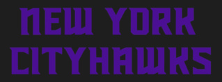
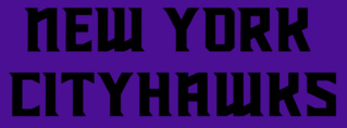
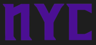
Wordmarks:



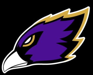
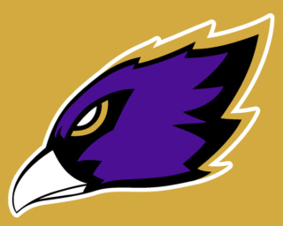
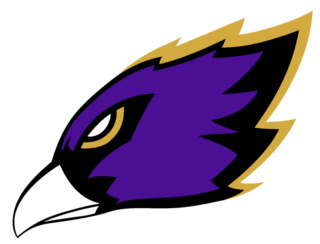
Logos:

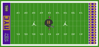
Fields:
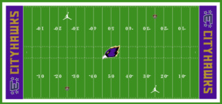
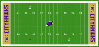
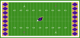
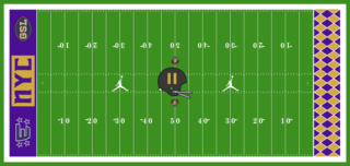
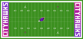
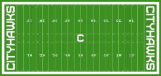
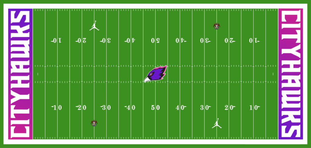
This field above is used for when there are events at MetLife Stadium before a CityHawks game, and the grounds crew can't paint the field in time. If there are no such events that take place before a CityHawks game, this field is to be used in week 17.
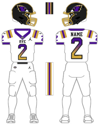
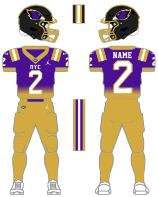
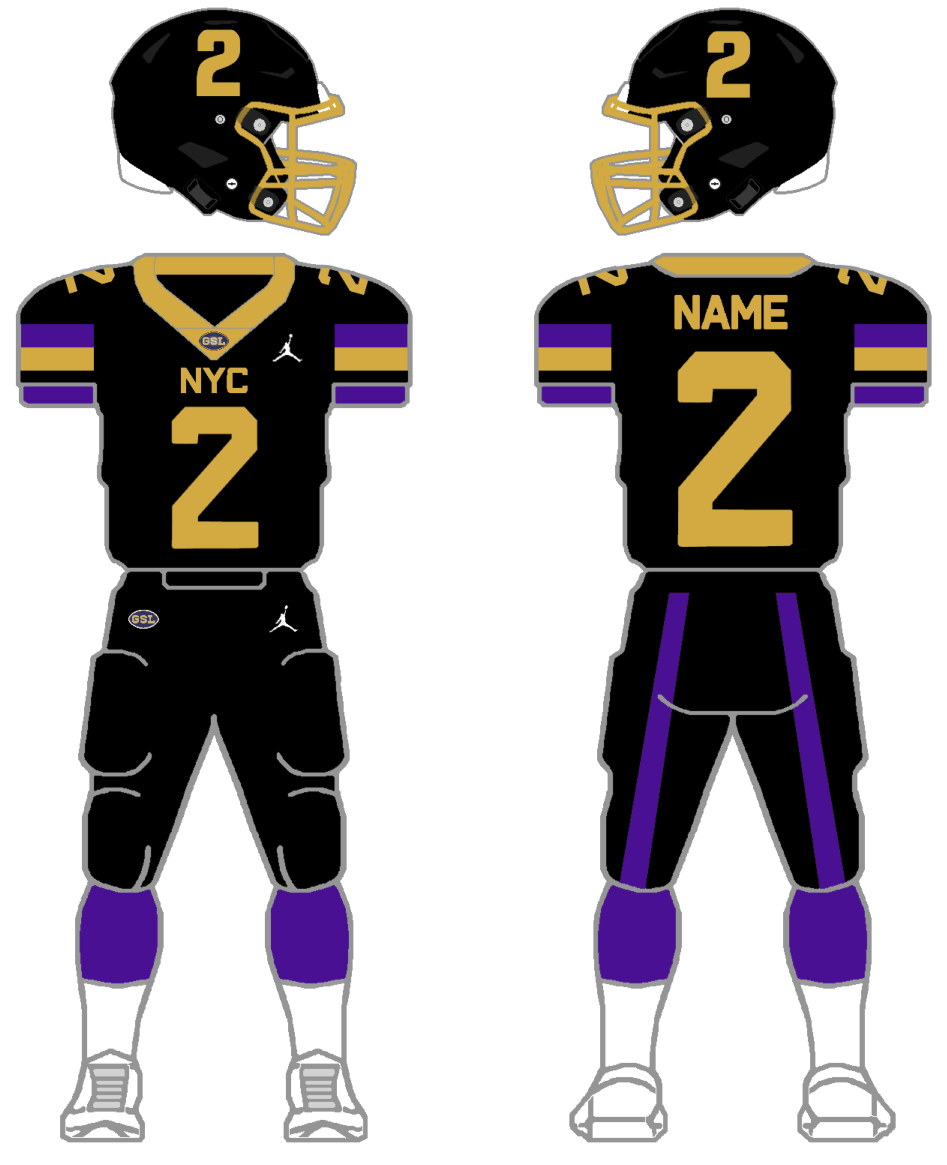
And finally, Uniforms:
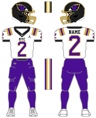

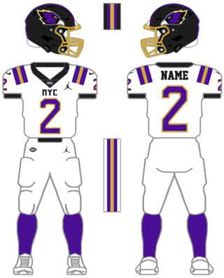
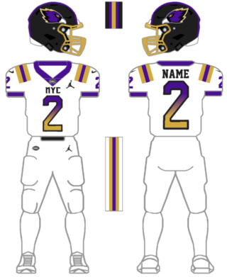
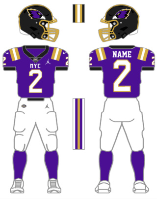
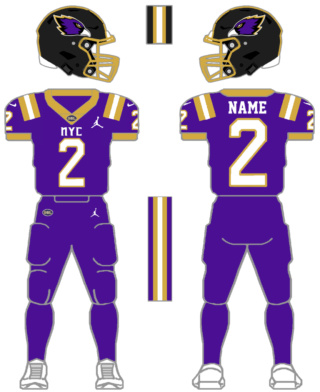
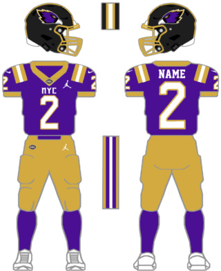


As I mentioned, there is one more uniform and field to be released later. You will know it when you see it. Critiques will be appreciated, and if you want a full 1024 pixel width of any one of these images please tell me below. Hope you enjoy these very dedicated new looks!
- Carter Brolyer
Colors have long played an integral role in representing the essence of a team, reflecting its values, history, and aspirations. The choice of purple and gold for this football team's transformation is a masterstroke, encapsulating various symbolic meanings and evoking a sense of regality and grandeur. Purple embodies attributes such as nobility, ambition, creativity, and wisdom, while gold represents excellence, victory, and prosperity. This color scheme not only reflects the team's pursuit of greatness but also signifies their commitment to elevating the game and mesmerizing fans with their prowess on the field. The most important asset of the new color scheme is to reflect on the team's history, originally named after an Arena Football League team going by the same nickname, the "CityHawks". Although the team moved after a couple of seasons, the story of the team moves on, taking a new life in the Gridiron Simulation League.
The unveiling of a team's new uniforms can be a momentous occasion, generating excitement among fans and players alike. The infusion of purple and gold into the team's attire is a bold departure from their previous color scheme, symbolizing a fresh start and a reimagined identity. The jerseys, adorned with intricate design elements and innovative fabrics, blend the rich tones of purple and gold harmoniously. As players don these new uniforms, they are not only embracing a new chapter in their careers but also carrying the weight of a tradition defined by brilliance and audacity.
The playing field is not merely a battleground; it serves as a canvas for the team's artistry, passion, and tenacity. In the wake of their purple and gold transformation, the team's home field undergoes a stunning metamorphosis. The lush green grass is interspersed with vibrant purple accents, showcasing the team's dominance and imbuing the atmosphere with an air of mystique. The transformed field becomes a stage upon which legends are born, and victories are etched into the books of sports history.
Every team's identity is reinforced by their distinctive wordmarks and logos. The new wordmarks are crafted with precision, featuring sleek, bold typography that seamlessly blends the regal hues of purple and gold. These wordmarks embody the team's new ethos, projecting strength, unity, and a relentless pursuit of success. Complementing the wordmarks, the logos exhibit intricate motifs inspired by the team's history and culture, incorporating the majestic purple and shimmering gold as the cornerstone of their visual identity. These emblems will adorn merchandise, signage, and banners, connecting fans with their beloved team and fostering a sense of belonging.
The transformation of a football team's uniforms, fields, wordmarks, and logos is a momentous occasion that shapes the team's narrative and resonates deeply with its supporters. Introducing a vibrant purple and gold color scheme not only revitalizes the team's image but also encapsulates their aspirations for greatness, symbolizing nobility, ambition, excellence, and victory. This visual transformation represents a new chapter in the team's history, infusing the sport with a captivating aura and inspiring their dedicated fanbase to rally behind them with renewed fervor. As the team takes to the field in their resplendent purple and gold in 2024, they embark on a journey that transcends the game, leaving an indelible mark on the hearts of fans and etching their names in the tapestry of sporting excellence.
Without further ado, the new and improved New York CityHawks!
Wordmarks:


Logos:


Fields:


This field above is used for when there are events at MetLife Stadium before a CityHawks game, and the grounds crew can't paint the field in time. If there are no such events that take place before a CityHawks game, this field is to be used in week 17.
And finally, Uniforms:


As I mentioned, there is one more uniform and field to be released later. You will know it when you see it. Critiques will be appreciated, and if you want a full 1024 pixel width of any one of these images please tell me below. Hope you enjoy these very dedicated new looks!
- Carter Brolyer
Last edited by CarterB2 on Sat Aug 26, 2023 3:26 pm; edited 11 times in total

CarterB2- Posts : 317
Join date : 2022-10-20
Location : Fort Collins, CO
Austin Snelick, sfcom1, spencer_g, Patrick Barnes, Curtis and Appleman20 like this post
 Re: New York CityHawks 2024 uniforms, fields, logos, and wordmarks reveal
These uniforms look amazing. There are a few things I don't like.
1. The purple face mask - I think the purple face mask looks better on the white and purple combos instead of the all-white.
2. (My personal opinion, you can ignore it) - the faded uniforms don't look good. It reminds me of what the Falcons did.
3. The helmet strip - I think the helmet strip on the white and purple combo should be the same as the home's uniforms.
Overall, these uniforms are good, with a 9/10 rating. I can't wait to see them on the field next year.

Appleman20- Posts : 369
Join date : 2021-09-01
sfcom1, Patrick Barnes, Appleman20 and CarterB2 like this post
 Re: New York CityHawks 2024 uniforms, fields, logos, and wordmarks reveal
Appleman20 wrote:These uniforms look amazing. There are a few things I don't like.
1. The purple face mask - I think the purple face mask looks better on the white and purple combos instead of the all-white.
2. (My personal opinion, you can ignore it) - the faded uniforms don't look good. It reminds me of what the Falcons did.
3. The helmet strip - I think the helmet strip on the white and purple combo should be the same as the home's uniforms.
Overall, these uniforms are good, with a 9/10 rating. I can't wait to see them on the field next year.
Thanks, it means a lot.
1: Yea, I think I will just remove the purple facemask entirely. It just doesn't contrast well with the black helmets.
2. This is gonna come off weird, but I like what the Falcons did, I'm a sucker for gradient unis.
3.
I'll fix the unis and send a new version in a couple of minutes. Once again thanks.

CarterB2- Posts : 317
Join date : 2022-10-20
Location : Fort Collins, CO
Patrick Barnes and Appleman20 like this post
 Re: New York CityHawks 2024 uniforms, fields, logos, and wordmarks reveal
Fixed and updated uniforms.
1. Removed purple facemask
2. Changed helmet stripe on NY_A1 to match helmet stripes on all home uniforms
3. Fixed NY_H4 pant stripe (before the perimeter stripe was gold instead of purple)
1. Removed purple facemask
2. Changed helmet stripe on NY_A1 to match helmet stripes on all home uniforms
3. Fixed NY_H4 pant stripe (before the perimeter stripe was gold instead of purple)

CarterB2- Posts : 317
Join date : 2022-10-20
Location : Fort Collins, CO
Appleman20 likes this post

CanadianBacon43- Posts : 604
Join date : 2021-09-03
Age : 26
Appleman20 and CarterB2 like this post
 Re: New York CityHawks 2024 uniforms, fields, logos, and wordmarks reveal
CarterB2 wrote:In the realm of sports, the aesthetics associated with a team can captivate fans, instill a sense of identity, and create lasting memories. From legendary victories to iconic uniforms, these elements become emblematic of a team's spirit and legacy. In a thrilling turn of events, one football team has embarked on a journey of revitalization, announcing the release of their brand new uniforms, fields, wordmarks, and logos, all embracing a vibrant and majestic purple and gold color scheme. This essay explores the significance of this transformation and the profound impact it can have on the team and its devoted fanbase.
Colors have long played an integral role in representing the essence of a team, reflecting its values, history, and aspirations. The choice of purple and gold for this football team's transformation is a masterstroke, encapsulating various symbolic meanings and evoking a sense of regality and grandeur. Purple embodies attributes such as nobility, ambition, creativity, and wisdom, while gold represents excellence, victory, and prosperity. This color scheme not only reflects the team's pursuit of greatness but also signifies their commitment to elevating the game and mesmerizing fans with their prowess on the field. The most important asset of the new color scheme is to reflect on the teams history, originally named after a Arena Football League team going my the same nickname, the "CityHawks". Although the team moved after a couple of seasons, the story of the team moves on, taking a new life in the Gridiron Simulation League.
The unveiling of a team's new uniforms can be a momentous occasion, generating excitement among fans and players alike. The infusion of purple and gold into the team's attire is a bold departure from their previous color scheme, symbolizing a fresh start and a reimagined identity. The jerseys, adorned with intricate design elements and innovative fabrics, blend the rich tones of purple and gold harmoniously. As players don these new uniforms, they are not only embracing a new chapter in their careers but also carrying the weight of a tradition defined by brilliance and audacity.
The playing field is not merely a battleground; it serves as a canvas for the team's artistry, passion, and tenacity. In the wake of their purple and gold transformation, the team's home field undergoes a stunning metamorphosis. The lush green grass is interspersed with vibrant purple accents, showcasing the team's dominance and imbuing the atmosphere with an air of mystique. The transformed field becomes a stage upon which legends are born and victories are etched into the books of sports history.
Every team's identity is reinforced by their distinctive wordmarks and logos. The new wordmarks are crafted with precision, featuring sleek, bold typography that seamlessly blends the regal hues of purple and gold. These wordmarks embody the team's new ethos, projecting strength, unity, and a relentless pursuit of success. Complementing the wordmarks, the logos exhibit intricate motifs inspired by the team's history and culture, incorporating the majestic purple and shimmering gold as the cornerstone of their visual identity. These emblems will adorn merchandise, signage, and banners, connecting fans with their beloved team and fostering a sense of belonging.
The transformation of a football team's uniforms, fields, wordmarks, and logos is a momentous occasion that shapes the team's narrative and resonates deeply with its supporters. The introduction of a vibrant purple and gold color scheme not only revitalizes the team's image but also encapsulates their aspirations for greatness, symbolizing nobility, ambition, excellence, and victory. This visual transformation represents a new chapter in the team's history, infusing the sport with a captivating aura and inspiring their dedicated fanbase to rally behind them with renewed fervor. As the team takes to the field in their resplendent purple and gold in 2024, they embark on a journey that transcends the game, leaving an indelible mark on the hearts of fans and etching their names in the tapestry of sporting excellence.
Without further ado, the new and improved, New York CityHawks!
Wordmarks:
Logos:
Fields:
And finally Uniforms:
As I mentioned, there is one more uniform and field to be released at a later date. You will know it when you see it. Critiques will be appreciated, and if you want a full 1024 pixel width of any one of these images please tell me below. Hope you enjoy these very dedicated new looks!
- Carter Brolyer
Loved the forth field option, reminds me of the 1972 Three Rivers stadium turf design, the one from the immaculate reception!
Now I'm wondering if the GSL can wear any brand... it would've be cool to rock with the Logo Athletic logo...
Rafael Menoncin- Posts : 338
Join date : 2021-01-14
Age : 23
Appleman20 and CarterB2 like this post
 Re: New York CityHawks 2024 uniforms, fields, logos, and wordmarks reveal
Rafael Menoncin wrote:CarterB2 wrote:In the realm of sports, the aesthetics associated with a team can captivate fans, instill a sense of identity, and create lasting memories. From legendary victories to iconic uniforms, these elements become emblematic of a team's spirit and legacy. In a thrilling turn of events, one football team has embarked on a journey of revitalization, announcing the release of their brand new uniforms, fields, wordmarks, and logos, all embracing a vibrant and majestic purple and gold color scheme. This essay explores the significance of this transformation and the profound impact it can have on the team and its devoted fanbase.
Colors have long played an integral role in representing the essence of a team, reflecting its values, history, and aspirations. The choice of purple and gold for this football team's transformation is a masterstroke, encapsulating various symbolic meanings and evoking a sense of regality and grandeur. Purple embodies attributes such as nobility, ambition, creativity, and wisdom, while gold represents excellence, victory, and prosperity. This color scheme not only reflects the team's pursuit of greatness but also signifies their commitment to elevating the game and mesmerizing fans with their prowess on the field. The most important asset of the new color scheme is to reflect on the teams history, originally named after a Arena Football League team going my the same nickname, the "CityHawks". Although the team moved after a couple of seasons, the story of the team moves on, taking a new life in the Gridiron Simulation League.
The unveiling of a team's new uniforms can be a momentous occasion, generating excitement among fans and players alike. The infusion of purple and gold into the team's attire is a bold departure from their previous color scheme, symbolizing a fresh start and a reimagined identity. The jerseys, adorned with intricate design elements and innovative fabrics, blend the rich tones of purple and gold harmoniously. As players don these new uniforms, they are not only embracing a new chapter in their careers but also carrying the weight of a tradition defined by brilliance and audacity.
The playing field is not merely a battleground; it serves as a canvas for the team's artistry, passion, and tenacity. In the wake of their purple and gold transformation, the team's home field undergoes a stunning metamorphosis. The lush green grass is interspersed with vibrant purple accents, showcasing the team's dominance and imbuing the atmosphere with an air of mystique. The transformed field becomes a stage upon which legends are born and victories are etched into the books of sports history.
Every team's identity is reinforced by their distinctive wordmarks and logos. The new wordmarks are crafted with precision, featuring sleek, bold typography that seamlessly blends the regal hues of purple and gold. These wordmarks embody the team's new ethos, projecting strength, unity, and a relentless pursuit of success. Complementing the wordmarks, the logos exhibit intricate motifs inspired by the team's history and culture, incorporating the majestic purple and shimmering gold as the cornerstone of their visual identity. These emblems will adorn merchandise, signage, and banners, connecting fans with their beloved team and fostering a sense of belonging.
The transformation of a football team's uniforms, fields, wordmarks, and logos is a momentous occasion that shapes the team's narrative and resonates deeply with its supporters. The introduction of a vibrant purple and gold color scheme not only revitalizes the team's image but also encapsulates their aspirations for greatness, symbolizing nobility, ambition, excellence, and victory. This visual transformation represents a new chapter in the team's history, infusing the sport with a captivating aura and inspiring their dedicated fanbase to rally behind them with renewed fervor. As the team takes to the field in their resplendent purple and gold in 2024, they embark on a journey that transcends the game, leaving an indelible mark on the hearts of fans and etching their names in the tapestry of sporting excellence.
Without further ado, the new and improved, New York CityHawks!
Wordmarks:
Logos:
Fields:
And finally Uniforms:
As I mentioned, there is one more uniform and field to be released at a later date. You will know it when you see it. Critiques will be appreciated, and if you want a full 1024 pixel width of any one of these images please tell me below. Hope you enjoy these very dedicated new looks!
- Carter Brolyer
Loved the forth field option, reminds me of the 1972 Three Rivers stadium turf design, the one from the immaculate reception!
Now I'm wondering if the GSL can wear any brand... it would've be cool to rock with the Logo Athletic logo...
A high res version of the field, I think it's even better up close! Thanks for the feedback.

The story behind this field is pretty funny too, I was gonna have both the endzones look identical to one another (using the right endzone), but I forgot to remove the background on the "NYC" wordmark, and I thought it looked cool anyways, so I kept it.
Last edited by CarterB2 on Wed Jul 19, 2023 11:32 pm; edited 1 time in total

CarterB2- Posts : 317
Join date : 2022-10-20
Location : Fort Collins, CO
Austin Snelick, spencer_g, Rafael Menoncin and Appleman20 like this post
 Re: New York CityHawks 2024 uniforms, fields, logos, and wordmarks reveal
Updates:
Fixed gold in the endzones of NY_2024^3
Fixed gold in the endzones and numbers on helmet at midfield of NY_2024^4
Fixed gold in the endzones of NY_2024^3
Fixed gold in the endzones and numbers on helmet at midfield of NY_2024^4

CarterB2- Posts : 317
Join date : 2022-10-20
Location : Fort Collins, CO
Austin Snelick and Appleman20 like this post

CarterB2- Posts : 317
Join date : 2022-10-20
Location : Fort Collins, CO
Austin Snelick and Appleman20 like this post
 CityHawks Throwback Uniform
I promise this is my last change. I replaced NY_H2 with this throwback uniform to match the throwback field.
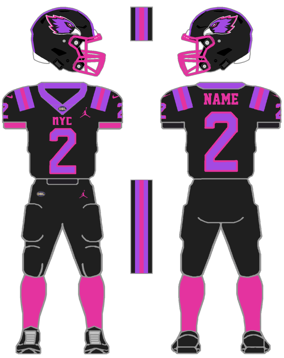
I intend to use this twice with the throwback field and the Purple and Pink uniform and field once. I will begin working on a uniform schedule for the 2024 season when the schedule is released. I might post it here, but I will likely make a new topic or a CityHawks media page like other owners.

I intend to use this twice with the throwback field and the Purple and Pink uniform and field once. I will begin working on a uniform schedule for the 2024 season when the schedule is released. I might post it here, but I will likely make a new topic or a CityHawks media page like other owners.


CarterB2- Posts : 317
Join date : 2022-10-20
Location : Fort Collins, CO
Appleman20 likes this post
 Re: New York CityHawks 2024 uniforms, fields, logos, and wordmarks reveal
Just a reminder, when you are completely done and satisfied with all your designs for the 2024 season, you must send an official email to me, with all of your full sized logos, wordmarks, uniforms, and fields for the 2024 season, before I can process them and get them up on the website.

Austin Snelick- Admin
- Posts : 1881
Join date : 2020-10-24
Age : 30
Location : Maryland
Appleman20 and CarterB2 like this post
 Re: New York CityHawks 2024 uniforms, fields, logos, and wordmarks reveal
I may have asked before, but what is the font for the CityHawks workdmark?

Austin Snelick- Admin
- Posts : 1881
Join date : 2020-10-24
Age : 30
Location : Maryland
Appleman20 likes this post
 Re: New York CityHawks 2024 uniforms, fields, logos, and wordmarks reveal
Austin Snelick wrote:Just a reminder, when you are completely done and satisfied with all your designs for the 2024 season, you must send an official email to me, with all of your full sized logos, wordmarks, uniforms, and fields for the 2024 season, before I can process them and get them up on the website.
Yeah, I knew, I just wanted to wait until October. Thanks for the reminder!
Last edited by CarterB10 on Tue Sep 26, 2023 11:04 pm; edited 1 time in total

CarterB2- Posts : 317
Join date : 2022-10-20
Location : Fort Collins, CO
Austin Snelick and Appleman20 like this post
 Re: New York CityHawks 2024 uniforms, fields, logos, and wordmarks reveal
Austin Snelick wrote:I may have asked before, but what is the font for the CityHawks workdmark?
The new 2024 wordmark is called Richardson Brand United.
Link to download:
https://fonts2u.com/richardson-brand-united.font

CarterB2- Posts : 317
Join date : 2022-10-20
Location : Fort Collins, CO
Austin Snelick and Appleman20 like this post
 Similar topics
» 2022 Fonts / Logos / Wordmarks / Fields
» 2024 Birmingham Owls uniforms reveal
» New York CityHawks Media Page
» Uniform and Field Combinations for Week 13 - 2022
» Uniform and Field Combinations for Week 11 - 2023
» 2024 Birmingham Owls uniforms reveal
» New York CityHawks Media Page
» Uniform and Field Combinations for Week 13 - 2022
» Uniform and Field Combinations for Week 11 - 2023
Page 1 of 1
Permissions in this forum:
You can reply to topics in this forum


