Jets NOB fonts 1970s
3 posters
The Gridiron Uniform Database Forum :: The Gridiron Uniform Database Forum :: Uniform Corrections & Suggestions
Page 1 of 1
 Jets NOB fonts 1970s
In the 1970s, the Jets wore several different types of fonts, including, quite frequently, variations worn within the same game. From 1971-74, they often had different NOB font for their home and road jerseys.
I'd like to make some corrections on the Jets NOB fonts during the 1970s. The Jets, while maybe not as bad as the Giants (this will be covered in a different post), used a lot of inconsistent fonts beginning in 1971.
1970: Simple block on both green and white jerseys.
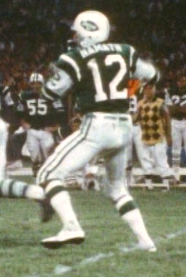
1971: Green jerseys: simple block font (same as 1970). White jerseys, either simple block (1970) or wide "funky font" (much wider and squatty) that often ran much higher on jersey, with a noticeable gap between the NOB and uniform number. The Bills and Patriots (NE less so) also used this style font for a time around the same period of 1971-74, and the St. Louis Cardinals also used it for a brief time. These jerseys, which appear to be mesh, were manufactured by Champion out of Rochester, NY. The funky font jerseys were only worn in early season warm weather games, which helps support the argument that they were mesh jerseys, as the NOB appears to be silk screened on as opposed to sewn on.
Also notice that these funky font jerseys are missing a shoulder loop!!
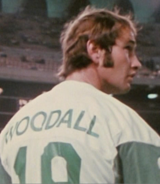
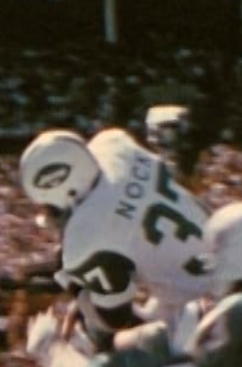
1972: Again, two types of font: simple block and funky font. Funky font was introduced for green jerseys this year, and was worn in Miami and some warmer early season games. However, also noticed players sometimes wore different NOB fonts in the same game for the first time. This year, the extra loop was not omitted.

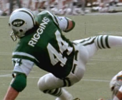
Team, simple block font. Notice that the green jerseys, because they're likely not mesh, have a slightly darker green color to them. Also, compare the numbers on these jerseys (thinner, sewn on) compared to the numbers on the funky font jerseys above, which are heavier font and silk screened.

I'd like to make some corrections on the Jets NOB fonts during the 1970s. The Jets, while maybe not as bad as the Giants (this will be covered in a different post), used a lot of inconsistent fonts beginning in 1971.
1970: Simple block on both green and white jerseys.

1971: Green jerseys: simple block font (same as 1970). White jerseys, either simple block (1970) or wide "funky font" (much wider and squatty) that often ran much higher on jersey, with a noticeable gap between the NOB and uniform number. The Bills and Patriots (NE less so) also used this style font for a time around the same period of 1971-74, and the St. Louis Cardinals also used it for a brief time. These jerseys, which appear to be mesh, were manufactured by Champion out of Rochester, NY. The funky font jerseys were only worn in early season warm weather games, which helps support the argument that they were mesh jerseys, as the NOB appears to be silk screened on as opposed to sewn on.
Also notice that these funky font jerseys are missing a shoulder loop!!


1972: Again, two types of font: simple block and funky font. Funky font was introduced for green jerseys this year, and was worn in Miami and some warmer early season games. However, also noticed players sometimes wore different NOB fonts in the same game for the first time. This year, the extra loop was not omitted.


Team, simple block font. Notice that the green jerseys, because they're likely not mesh, have a slightly darker green color to them. Also, compare the numbers on these jerseys (thinner, sewn on) compared to the numbers on the funky font jerseys above, which are heavier font and silk screened.

Ken Adams- Posts : 24
Join date : 2011-06-17
 Re: Jets NOB fonts 1970s
1973: same as ’72. Both green and white jerseys used two different types of fonts: simple block and funky font.
Simple block (sewn on)
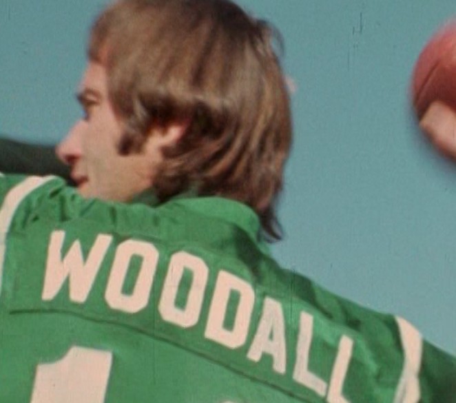
Funky font (silk screened)

1974: Both simple block and funky font still used both both green and white jerseys, but a third type of font is introduced, a bold block letter type font which was used for both green and white jerseys. This bold block font was silk screened on, similar to the funky font. All three fonts are mixed in same games, and the inconsistencies are becoming more pronounced.
Joe at Miami, MNF, sporting bold block

Both normal block and funky font in action at Chicago:

Bold block on green uni

Funky font on green uni
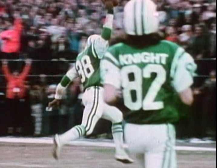
1975: Basic simple block is gone and only a few instances of funky font remain (on both green and white jerseys). It appears almost all players wear bold block letter style (both green and white jerseys), except for one strange instance where Burgess Owens shows first Jets instance of serif lettering that would later become popular in 1976-1979.
Bold block in 1975 (most players)
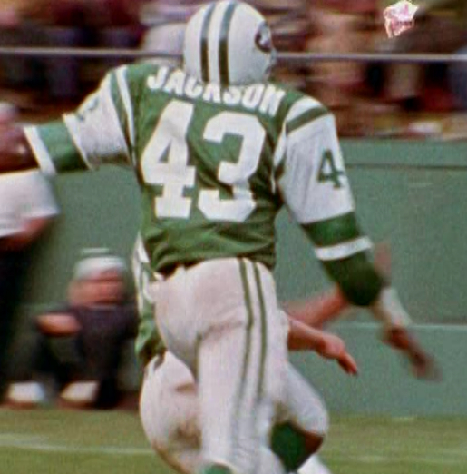
Rich Caster was one of the few holdovers still using the funky font jersey in '75
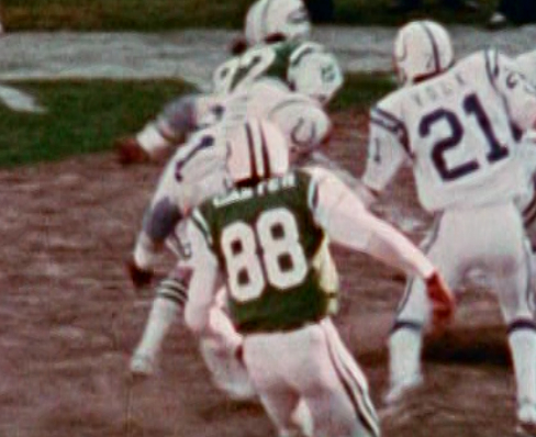
Burgess Owens with first instance of serif lettering seen on a Jets jersey. There is only evidence that it was on a green jersey, not white.

Simple block (sewn on)

Funky font (silk screened)

1974: Both simple block and funky font still used both both green and white jerseys, but a third type of font is introduced, a bold block letter type font which was used for both green and white jerseys. This bold block font was silk screened on, similar to the funky font. All three fonts are mixed in same games, and the inconsistencies are becoming more pronounced.
Joe at Miami, MNF, sporting bold block

Both normal block and funky font in action at Chicago:

Bold block on green uni

Funky font on green uni

1975: Basic simple block is gone and only a few instances of funky font remain (on both green and white jerseys). It appears almost all players wear bold block letter style (both green and white jerseys), except for one strange instance where Burgess Owens shows first Jets instance of serif lettering that would later become popular in 1976-1979.
Bold block in 1975 (most players)

Rich Caster was one of the few holdovers still using the funky font jersey in '75

Burgess Owens with first instance of serif lettering seen on a Jets jersey. There is only evidence that it was on a green jersey, not white.

Ken Adams- Posts : 24
Join date : 2011-06-17
 Re: Jets NOB fonts 1970s
1976: Almost exclusively serif (both green and white jerseys), with the exception of a couple of instances where plain block is used (both green and white).
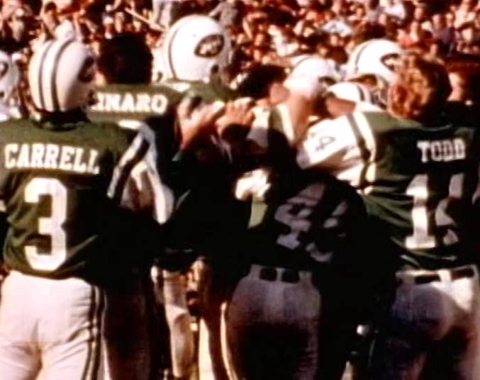

Block - on Tommy Marvaso on right (similar style to early 1970s):
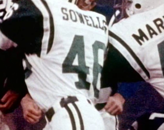
1977-1979 coming soon!


Block - on Tommy Marvaso on right (similar style to early 1970s):

1977-1979 coming soon!
Ken Adams- Posts : 24
Join date : 2011-06-17
 Re: Jets NOB fonts 1970s
Ken,
Thanks for the visuals. You don't know how MUCH Bill and I agonized over all of the Jets variations in the 1970's!! NOB fonts, numeral fonts, sleeve stripes (or lack thereof), etc. It was crazy!
Bill is away for a week, so when he returns, once we get to it, we'll make sure those 1969-1977 pages are good.
timmyb- Posts : 143
Join date : 2011-06-10
Age : 66
Location : Enola, PA
 Re: Jets NOB fonts 1970s
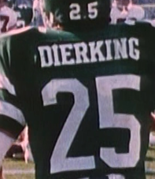
Finishing up our look at the Jets of the 1970s, we move to 1977. This was perhaps the simplest year for NOB fonts. All players wore the serif style lettering that was rolled out in 1976 for the team. This applied to both the white and green uniforms.
1978 is when we start seeing some font inconsistencies again, with two types of font used. The white jerseys appear to have gone the entire season with only one font, that's the serif style we saw in 1976-77:
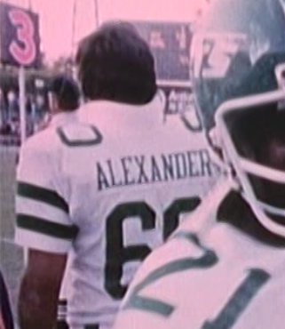
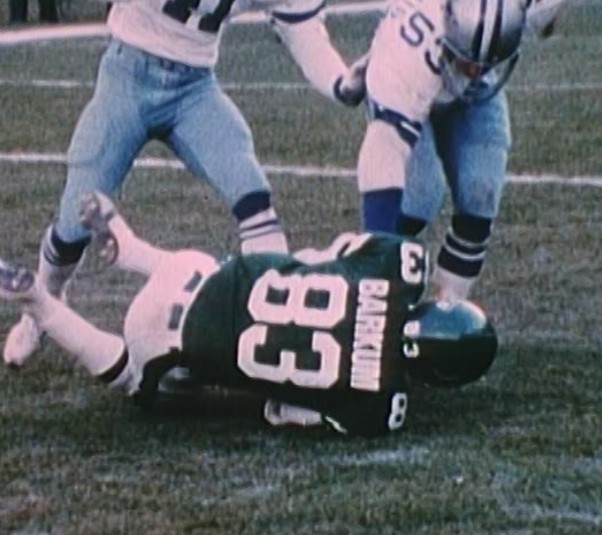
However, the green jerseys used both the serif style as well as a bold block that was somewhat reminiscent of the 1974-75 Jets. It appears this bold block was not introduced until the Jets last two home games of the season, when they wore them against the Colts (week 14) and Cowboys (week 16). Otherwise, the team wore serif fonts for their other 14 games.
Serif:
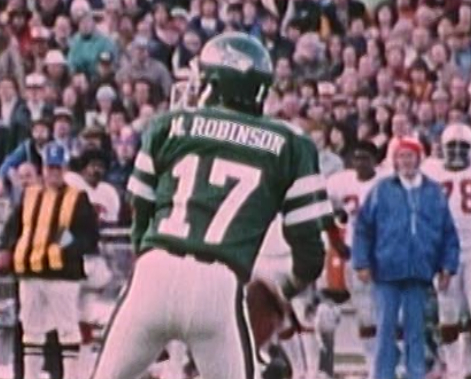
Bold block final two home games

In 1979, we predictably see all sorts of mixing and matching of the two 1978 font styles. On both the green and white jersey, we see players in the same game wearing both style fonts:
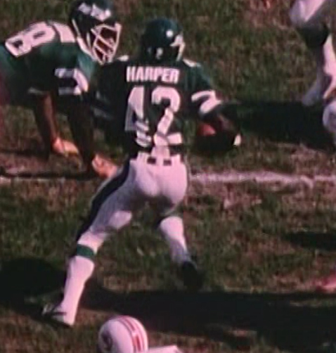
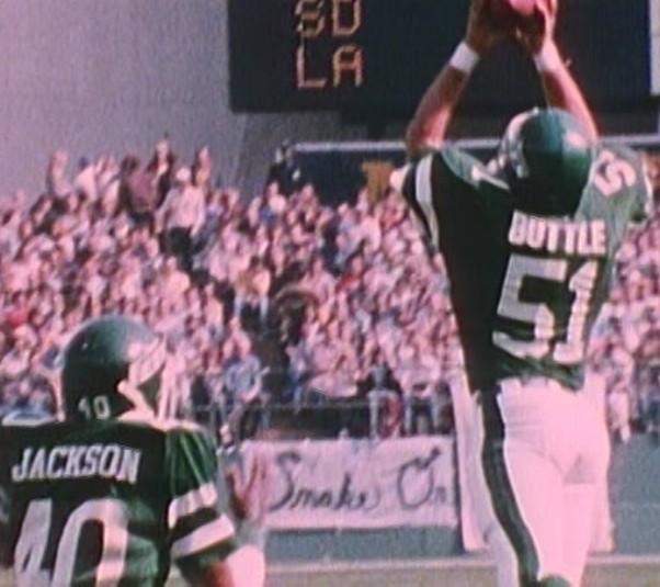
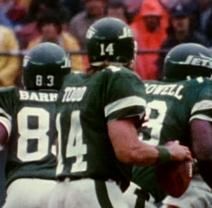

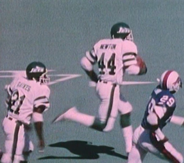
In the 1980s, the Jets all but dropped the serif style NOB font in favor of the bold block. More on that to come.
1978 is when we start seeing some font inconsistencies again, with two types of font used. The white jerseys appear to have gone the entire season with only one font, that's the serif style we saw in 1976-77:

However, the green jerseys used both the serif style as well as a bold block that was somewhat reminiscent of the 1974-75 Jets. It appears this bold block was not introduced until the Jets last two home games of the season, when they wore them against the Colts (week 14) and Cowboys (week 16). Otherwise, the team wore serif fonts for their other 14 games.
Serif:


Bold block final two home games


In 1979, we predictably see all sorts of mixing and matching of the two 1978 font styles. On both the green and white jersey, we see players in the same game wearing both style fonts:


In the 1980s, the Jets all but dropped the serif style NOB font in favor of the bold block. More on that to come.
Ken Adams- Posts : 24
Join date : 2011-06-17
Bill Schaefer- Posts : 1296
Join date : 2011-06-11
Age : 52
Location : Bradenton, FL
 Re: Jets NOB fonts 1970s
Bill, looks really good, my only suggestions are these:
1970: I don't believe they used the stripeless and the funky font starting until 1971
1970-74 simple block font: I think there should be a little more spacing between the letters (see WOODALL in 1973 green)
1974-75 bold block: I think this letters need to be even taller and a little more spacing between letters (check out NAMATH and JACKSON)
1978-79 white serif: The Alexander font was an anomaly. The serif font on both the green and white jerseys was virtually identical. So in 1978-79, I would change the serif font on the white jerseys to look the same as it did in 1976-77.
Ken Adams- Posts : 24
Join date : 2011-06-17
 Re: Jets NOB fonts 1970s
Bill - on the Jets 71-75 funky font, I think I've identified the name, at least I found something on Word that's extremely close to it. It's called "Blair ITC Medium" in all capitals. Also abbreviated as "BlairMdITC TT-Medium". The Jets font is slightly taller (less squatty)


Ken Adams- Posts : 24
Join date : 2011-06-17
 Re: Jets NOB fonts 1970s
Long night staring at Bills/Eagles from 1973.
The stripeless jersey in 1970 was worn by a half dozen or so players (including Namath) for a MNF(?) game in Houston when their jerseys were stolen (?). Tim knows the story better than I.
I'll work on the rest tomorrow and show you what I come up with.
Thanks.
B
The stripeless jersey in 1970 was worn by a half dozen or so players (including Namath) for a MNF(?) game in Houston when their jerseys were stolen (?). Tim knows the story better than I.
I'll work on the rest tomorrow and show you what I come up with.
Thanks.
B

Bill Schaefer- Posts : 1296
Join date : 2011-06-11
Age : 52
Location : Bradenton, FL

Bill Schaefer- Posts : 1296
Join date : 2011-06-11
Age : 52
Location : Bradenton, FL
 Re: Jets NOB fonts 1970s
Looks brilliant! I think you nailed all years now.
Ken Adams- Posts : 24
Join date : 2011-06-17
 Re: Jets NOB fonts 1970s
Jets wore the white stripeless jersey for the October 10, 1970 game at Miami.
timmyb- Posts : 143
Join date : 2011-06-10
Age : 66
Location : Enola, PA
 Similar topics
» Patriots 1970s NOB Fonts
» color and style of Rams belts in mid 1970s
» vikings belts colors in 1960s and 1970s
» 1964 NY Jets
» Giants number fonts, early 90's
» color and style of Rams belts in mid 1970s
» vikings belts colors in 1960s and 1970s
» 1964 NY Jets
» Giants number fonts, early 90's
The Gridiron Uniform Database Forum :: The Gridiron Uniform Database Forum :: Uniform Corrections & Suggestions
Page 1 of 1
Permissions in this forum:
You cannot reply to topics in this forum|
|
|


