
More Giants font discrepancies 1976-79
The Gridiron Uniform Database Forum :: The Gridiron Uniform Database Forum :: Uniform Corrections & Suggestions

More Giants font discrepancies 1976-79
![]() Ken Adams Mon Jun 27, 2011 12:53 pm
Ken Adams Mon Jun 27, 2011 12:53 pm

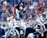
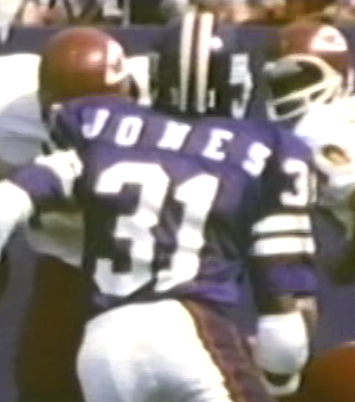
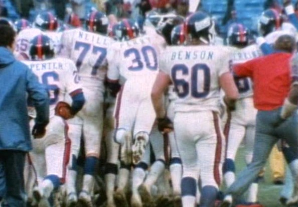
1979 game at LA. I don't believe the "serif" style was introduced for the Giants until 1978.
Last edited by Ken Adams on Mon Jun 27, 2011 3:25 pm; edited 1 time in total
Ken Adams- Posts : 24
Join date : 2011-06-17
Re: More Giants font discrepancies 1976-79
![]() Ken Adams Mon Jun 27, 2011 1:13 pm
Ken Adams Mon Jun 27, 2011 1:13 pm
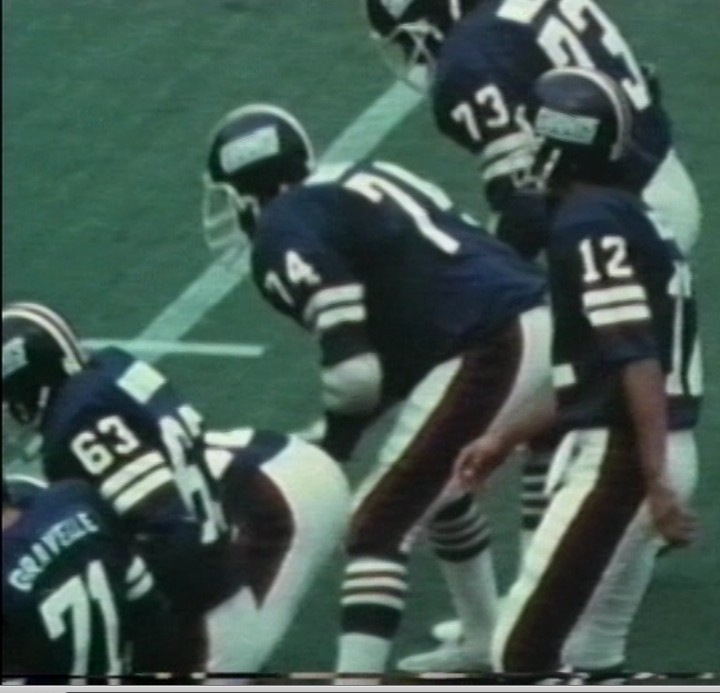
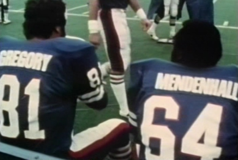
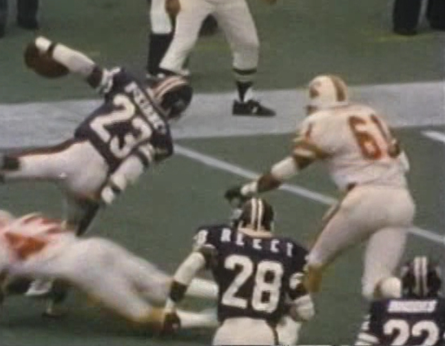
Gordon Gravelle with the smaller type font, the other linemen with the bold block
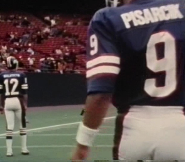
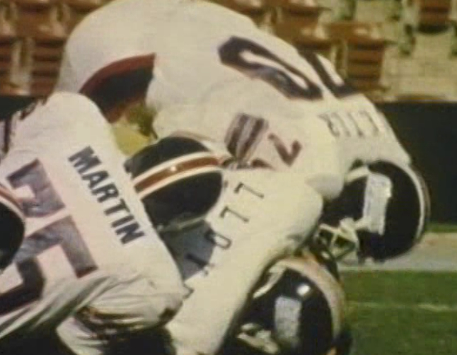
The QBs had different font styles. Joltin' Joe Pisarcik with the bold block...
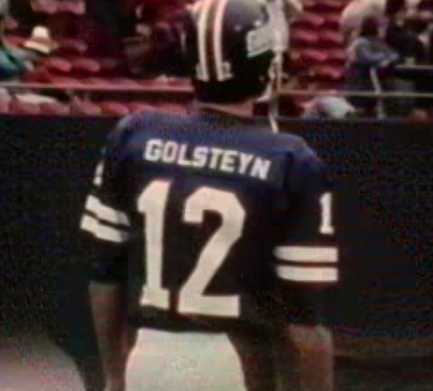
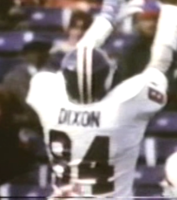
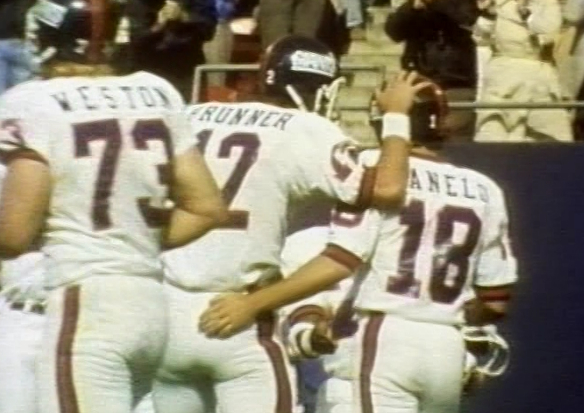
...and a closer look at the legendary QB backup Jerry Golsteyn with the smaller font:
Most used in '77 and '78 was the bold block
Ken Adams- Posts : 24
Join date : 2011-06-17
Re: More Giants font discrepancies 1976-79
![]() Ken Adams Mon Jun 27, 2011 3:37 pm
Ken Adams Mon Jun 27, 2011 3:37 pm
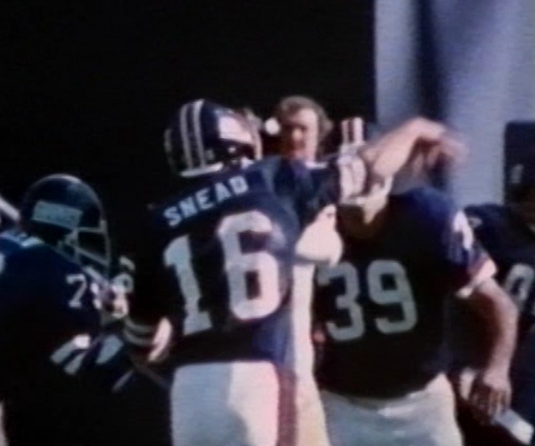
The blue uniforms appear to have exclusively used a basic block font (not the bold block that became prevalent in '77 and '78). This block font had slightly smaller point size than the bold block, and was less squeezed together than the bold block.

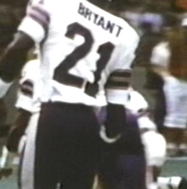
Stormin' Norman Snead in basic block:
In '76, different story with the whites. The most commonly used font was the heavy bold block, which was used for the first time by the Giants this particular season.
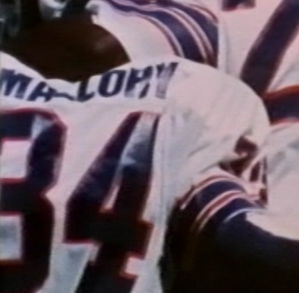
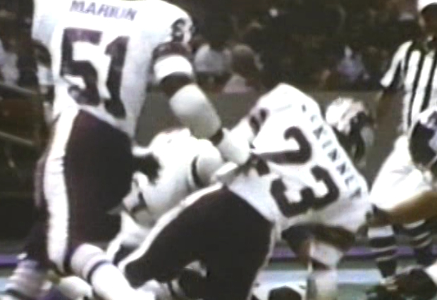
However, sometimes the basic block was used on the whites as well:
I haven't looked at '75 yet, but I don't recall there being much in terms of font inconsistencies from that period.
Last edited by Ken Adams on Tue Jul 05, 2011 3:35 pm; edited 1 time in total
Ken Adams- Posts : 24
Join date : 2011-06-17
Re: More Giants font discrepancies 1976-79
![]() Bill Schaefer Sun Jul 03, 2011 5:03 pm
Bill Schaefer Sun Jul 03, 2011 5:03 pm
Let me know if something is there that shouldn't be or if I forgot to include something.
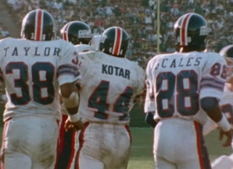
Also, the seriffed font that I used for 1978 looks dead on to me - especially when I used it to spell out SCALES and TAYLOR like in the picture.
My question is did it stay spread out like that for the duration (through 1994) or did it get a little more closed up without the extra space eventually like we have it now?
Here's what I came up with...

Bill Schaefer- Posts : 1294
Join date : 2011-06-11
Age : 52
Location : Bradenton, FL
Re: More Giants font discrepancies 1976-79
![]() Ken Adams Mon Jul 04, 2011 6:22 pm
Ken Adams Mon Jul 04, 2011 6:22 pm
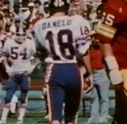
I have some suggestions for the others, although think they're very close. I think the basic block letters on the 1976-78 jerseys should be slightly wider, the letters appear to narrow.
The bold block used for 1976 whites and 1977-78 blue and whites, needs to be included for 1979 blue jerseys. Also, the thickness of the bold block letters should be even heavier/bolder so there is less space between the letters (look at how heavy the PISARCIK font is, there is barely any spacing between the letters). However, a less heavy bold block was used for the 1978-79 road whites (pics to come tomorrow).
I also think you perfected the "small block" font used exclusively in 1977.
I just finished some more work going through the Giants 1978-1981. The good news is that beginning in 1980, the Giants finally stayed with ONE CONSISTENT FONT and that's the serif that we became used to when they were winning Super Bowls. The bad news is, there are going to be some slight modifications to the 1978 whites and the 1979 blue and whites, alluded to above. I will post those photos tomorrow.
Ken Adams- Posts : 24
Join date : 2011-06-17
Re: More Giants font discrepancies 1976-79
![]() Bill Schaefer Mon Jul 04, 2011 8:39 pm
Bill Schaefer Mon Jul 04, 2011 8:39 pm

I thickened the bold block to the point where its almost unreadable.
I found a squarish regular block that matches up really well with "VAN HORN," "COUSINS," and "CHANDLER" and I think the size is a pretty good match too.
What do you say?
Bill Schaefer- Posts : 1294
Join date : 2011-06-11
Age : 52
Location : Bradenton, FL
Re: More Giants font discrepancies 1976-79
![]() Ken Adams Tue Jul 05, 2011 10:33 am
Ken Adams Tue Jul 05, 2011 10:33 am
I honestly cannot believe the variations in both New York teams throughout the 70s. I don't think any other teams come close to it, but perhaps more research will reveal otherwise.
Ken Adams- Posts : 24
Join date : 2011-06-17
Re: More Giants font discrepancies 1976-79
![]() Ken Adams Tue Jul 05, 2011 11:55 am
Ken Adams Tue Jul 05, 2011 11:55 am
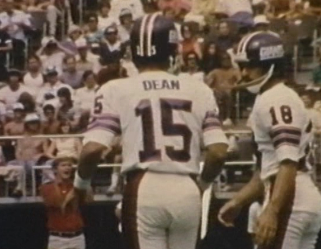
1. Heavy bold block - used 1977-79 blues and 1976-77 whites.
2. Bold block - used 1978-79 whites (NEW, see pic below)
3. Basic block - used 1976-77 blues and 1976-77 whites
4. Small block - used 1977 blues only
5. Basic serif - used 1978-into 1990s both blues and whites
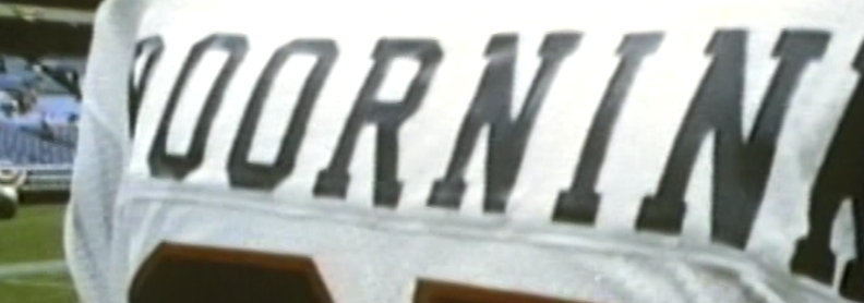
6. Stretched serif - used 1978-into at least 1982 both blues and whites
Bill just one comment on your 1980 serif. The 1980 serif letters appear to be narrower and taller than the 1978-79 serif. The serif font size should be consistent from its inception in 1978 at least into 1982. The only variation is how stretched out the names were (spacing in between letters).
The new font I've added is "bold block" which was used only on the 1978 and 1979 whites. This font was not as heavy as the "heavy bold block" used on the 1976-79 blues and 1976-77 whites:
"Bold block" from 1978:

"Bold block" and stretched serif used together in same game, 1978:
"Bold block" from 1979:
Here are more photos:
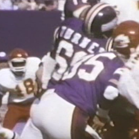
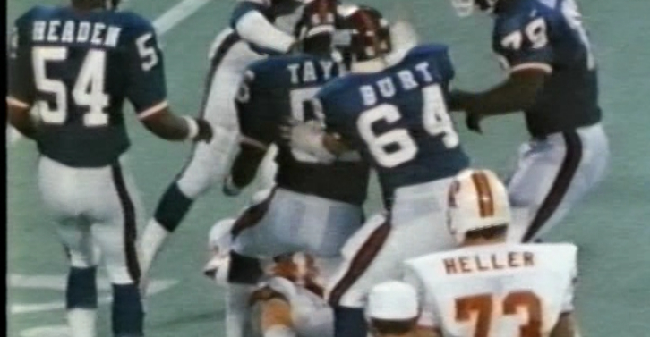
1978, blue serif stretched, J.T. Turner (notice the "R" appears to be affixed backwards)
1978, white basic serif ('78 was the first year the Giants used serif font)
1978, white stretched serif
1978, blue stretched serif
1978, white stretched serif and bold block mixed

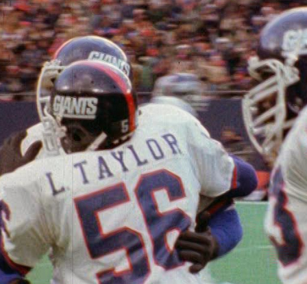
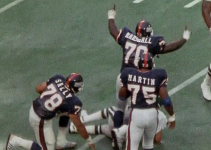
1979, blue "heavy bold block"

1979, blue "heavy bold block", "stretched serif" and "basic serif" mixed
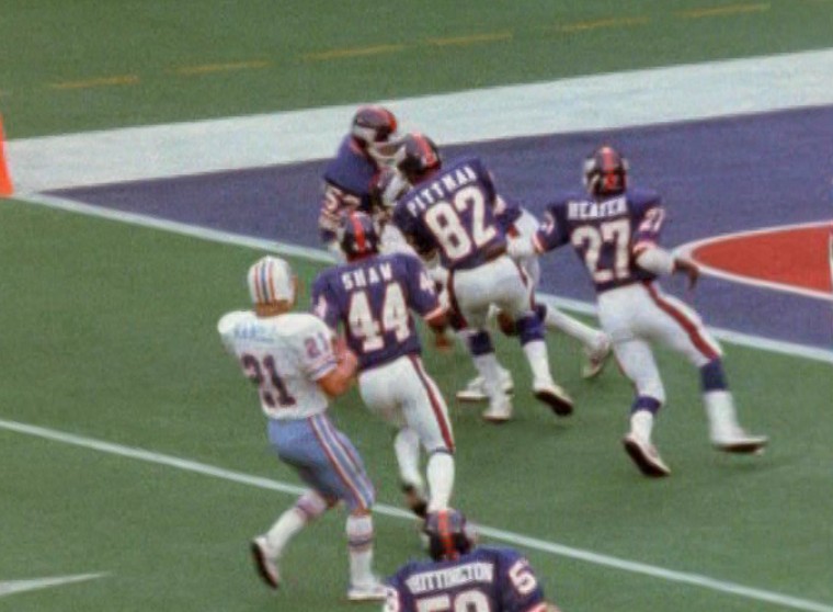
1979, white "stretched serif" and "bold block" mixed
By 1980, we finally stopped the madness a bit. With the rollout of the Giants cleaned up uniforms and slightly modified helmet, we saw them consistently use just one type of font, the serif that was rolled out in 1978. The only variations were that some players names were stretched out and some were not as much. This lasted at least through 1982.
1980:

1981:

1982:
Last edited by Ken Adams on Tue Jul 05, 2011 3:35 pm; edited 2 times in total
Ken Adams- Posts : 24
Join date : 2011-06-17
Re: More Giants font discrepancies 1976-79
![]() Ken Adams Tue Jul 05, 2011 1:17 pm
Ken Adams Tue Jul 05, 2011 1:17 pm
1. Heavy bold block - used 1977-79 blues and 1976-77 whites.
2. Bold block - used 1978-79 whites (NEW, see pic below)
3. Basic block - used 1976-77 blues and 1976-77 whites
4. Small block - used 1977 blues only
5. Basic serif - used 1978-into 1990s both blues and whites
6. Stretched serif - used 1978-into at least 1982 both blues and whites
1976 blues - 3
1976 whites - 1, 3
1977 blues - 1, 3, 4
1977 whites - 1, 3
1978 blues - 1, 5, 6
1978 whites - 2, 5, 6
1979 blues - 1, 5, 6
1979 whites - 2, 5, 6
1980 to ? blues - 5, 6
1980 to ? whites - 5, 6
Ken Adams- Posts : 24
Join date : 2011-06-17
Re: More Giants font discrepancies 1976-79
![]() Bill Schaefer Tue Jul 05, 2011 3:23 pm
Bill Schaefer Tue Jul 05, 2011 3:23 pm
I think I've got what you describe.

I went back to the original bold block (before I made it the 'heavy' bold block) for the 'regular bold block.'
The only lingering question is...At what point do I no longer need BOTH the regular serif and the spaced regular serif?
Bill Schaefer- Posts : 1294
Join date : 2011-06-11
Age : 52
Location : Bradenton, FL
Re: More Giants font discrepancies 1976-79
![]() Ken Adams Tue Jul 05, 2011 3:30 pm
Ken Adams Tue Jul 05, 2011 3:30 pm
Ken Adams- Posts : 24
Join date : 2011-06-17
Re: More Giants font discrepancies 1976-79
![]() Bill Schaefer Tue Jul 05, 2011 4:46 pm
Bill Schaefer Tue Jul 05, 2011 4:46 pm
since we're at 1980 with only the 2 identical seriffs (if you'll pardon the pun) seperated by the difference in spacing, would it not make better sense to kinda split the difference and only show the jerseys once each?
Bill Schaefer- Posts : 1294
Join date : 2011-06-11
Age : 52
Location : Bradenton, FL
Re: More Giants font discrepancies 1976-79
![]() Ken Adams Tue Jul 05, 2011 5:42 pm
Ken Adams Tue Jul 05, 2011 5:42 pm
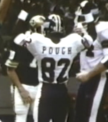
I just checked the Giants for '83, '84 and '85. Same exact thing as '80-'82. Some players had lots of spacing, some didn't. Here are some grabs:
1984
1985
I have noticed that the most egregious spacing occurred from 1978-1981. Seems to be toned down slightly starting in 1982.
Ken Adams- Posts : 24
Join date : 2011-06-17
Re: More Giants font discrepancies 1976-79
![]() Bill Schaefer Tue Jul 05, 2011 7:01 pm
Bill Schaefer Tue Jul 05, 2011 7:01 pm
I'll consult with Tim on how he thinks we should show this.
Thanks for the assist! I'm sure we'll be at it again soon on the Jets.
Bill
Bill Schaefer- Posts : 1294
Join date : 2011-06-11
Age : 52
Location : Bradenton, FL
Re: More Giants font discrepancies 1976-79
![]() Ken Adams Wed Jul 06, 2011 7:26 am
Ken Adams Wed Jul 06, 2011 7:26 am
Ken Adams- Posts : 24
Join date : 2011-06-17
Re: More Giants font discrepancies 1976-79
![]() Bill Schaefer Wed Jul 06, 2011 8:18 am
Bill Schaefer Wed Jul 06, 2011 8:18 am
Bill Schaefer- Posts : 1294
Join date : 2011-06-11
Age : 52
Location : Bradenton, FL
Re: More Giants font discrepancies 1976-79
![]() Bill Schaefer Wed Jul 06, 2011 10:27 am
Bill Schaefer Wed Jul 06, 2011 10:27 am
1986 no extra spaces

1985 no extra spaces

1984 is a tough call
December Wild Card Playoff at LA - even though his jerseys getting pulled, there looks to be spacing between the S and the I

Early 1984 - also at LA, there is some amount of space between letters that appears less than the WC photo - probably from the stretching.

My conclusion...
We should probably show spacing differentials up through 1984.
Last edited by Bill Schaefer on Wed Jul 06, 2011 11:02 am; edited 1 time in total
Bill Schaefer- Posts : 1294
Join date : 2011-06-11
Age : 52
Location : Bradenton, FL
Re: More Giants font discrepancies 1976-79
![]() Market42 Wed Jul 06, 2011 10:48 am
Market42 Wed Jul 06, 2011 10:48 am
Ken Adams wrote:
1985
Something else I saw in the 1985 pic that caught my attention, as I had thought that the numerals went to the traditional block number style across the board by then. Maybe it may have been a player-by-player case for 1985 and the traditional style might have been standardarized by 1986.
Market42- Posts : 35
Join date : 2011-07-05
Age : 37
Location : Hertford, NC
» POST YOUR ODDITIES!
» Giants 1976-79 sleeves and socks stripes.
» the '27 Football giants.... and some other Giants notes
» Missing Uniform Info on Preseason Games from 1950-Present?
The Gridiron Uniform Database Forum :: The Gridiron Uniform Database Forum :: Uniform Corrections & Suggestions
|
|
|